VISUALS: For all learners
In Physical Education, we teach all students. Some do not speak English, some have special needs, and some of our littlest learners simply haven’t been to school before. Quite often, we are teaching students who encompass one, or even all, of these characteristics.
I’m fortunate to have access to a projector screen that I use for visual supports in my gym. Through collaboration with my amazing English Language and kindergarten staff, I’ve picked up tips and tricks along the way to ensure my visuals are meaningful, accessible, and conducive to learning.
Yes, Canva and many resources from Teachers Pay Teachers are aesthetically pleasing, but they may not be reaching as many students as we think.
Take a look at the fonts you’re using:
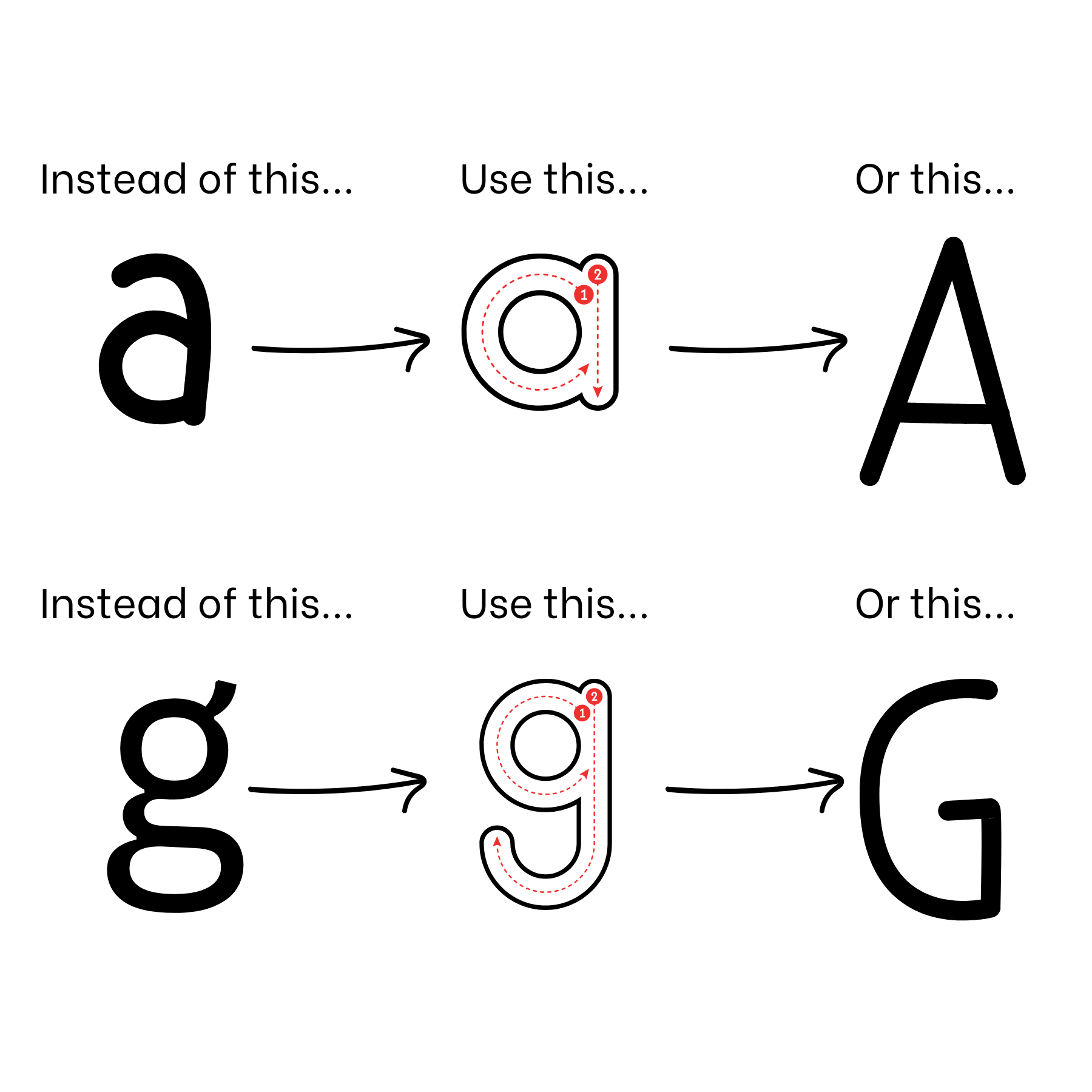
Those fancy script fonts definitely have a place; however, for student accessibility, they can sometimes be confusing and challenging to read. When students are first taught to write the letter “A,” they use a top-down method with a circle and a line. In many commonly used fonts, the letters “a” and “g” appear as “double-story” letters, which can be unfamiliar and frustrating for young learners.
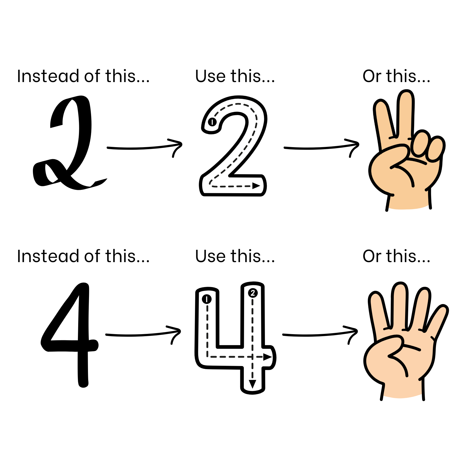
Consider using ALL CAPITAL LETTERS or choosing fonts that use only “single-story” letters. Be Vietnam, Afacad Flux, and Lilita One are some of my go-to fonts. Also, watch out for extras like loops on the number 2 or triangles on the number 4. Pairing numbers with finger pictures and correct number formations, especially those taught in preschool and kindergarten can make a big difference.
Simplifying the words you use is just as important:
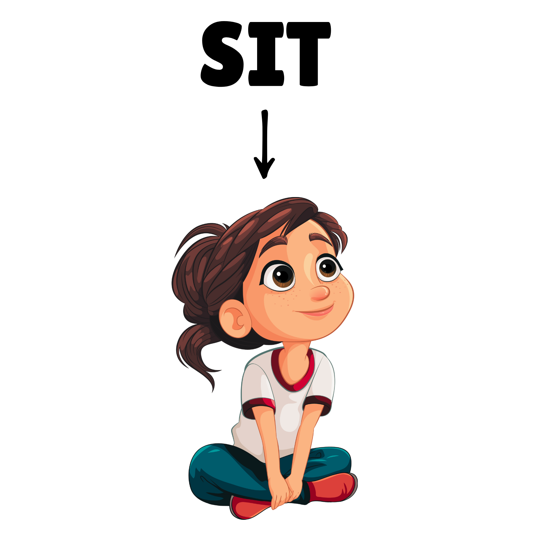
When posting directions, use arrows and pictures to support what you want students to do. For example, when we play a game called Sit, Stand, Lay Down, each direction includes a picture, an arrow, and a single-tense word. Sitting becomes SIT, standing becomes STAND, and laying down becomes LAY DOWN.
Tweaking a few visuals might be all it takes to scoop up a few more kiddos along the way.
Keep on,
Katie